
L17.1: Population, Aggregate Income, and Percent
| Fifth of the Population | Aggregate Income ($) | Percent Aggregate Income (%) |
|---|---|---|
| Lowest Fifth | 76,400 | 3.82 |
| Second Fifth | 190,400 | 9.52 |
| Third Fifth | 316,400 | 15.82 |
| Fourth Fifth | 480,400 | 24.02 |
| Highest Fifth | 936,400 | 46.82 |
| Total | 2,000,000 | 100% |
| Fifths of the Population | Cumulative Percent Aggregate Income |
|---|---|
| Lowest Fifth | 3.82% |
| Lowest Two-Fifths | 13.34% |
| Lowest Three-Fifths | 29.16% |
| Lowest Four-Fifths | 53.16% |
| All Fifths | 100% |
What does L17.1 and L17.2 tell us?
When we look at the data above, we can get a decent picture of wealth distribution in this supposed society: we can gather that the top one-fifth of the population in this scenario makes up almost the same percentage of the total income of the other four-fifths. This observation leads us to the fact that this society is not in a state of equity, as a tiny section of this scenario (which happens to be the richest) makes up a considerable chunk of the overall income. Each section should make up an equal amount of the comprehensive income in an equitable society: if this scenario were fair, then the four-fifths of the population would make up 80% of the income, while the one-fifths would make up 20%. In an equal society, there should be no possibility that a lower representation of the population has a higher or even similar income than a higher representation. However, that is precisely what we get in this scenario, allowing us to declare that this is an example of income inequity. However, to get a more in-depth sense of income inequality, it is not sufficient to just look at tables such as these. We must look at other forms, such as graphs, to compare the current state of income relations to the dream of total equity. To do that, we must look at Lorenz curves and the Gini Coefficient.
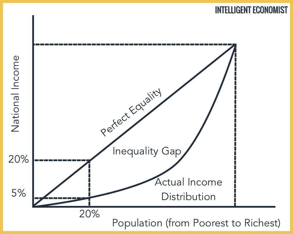
L17.3: Why Must a Lorenz Curve Always Increase?
A Lorenz Curve shows us the actual makeup of income that a designated percentage of people make in a country. We start off knowing that 0% of the population is responsible for 0% of the nation's income, and we end up learning that 100% of a nation's citizens make up 100% of the revenue. A Lorenz Curve allows us to see the actual amount of income made by a particular section of the population. Since the amount of income made increases as you consider a more significant section of the population, the Lorenz curve must be increasing, even if it is not at a constant amount. In addition, since a group cannot produce negative income, the graph will increase in the parameters of the Lorenz curve since the additional sections considered will have some income that contributes to the national pool.
Imagine if everyone at Poly Prep has a certain number of cookies. Using a Lorenz curve, we can distinguish how much of the total cookie supply the bottom percentile has, all the way up to the top percentile. As we go through the percentiles, the amount of cookies that we discover will increases because 1) no one has negative cookies and 2) we are taking the sum of all the cookies people have, so the amount has to increase. If a Lorenz curve were to decrease instead of increase, it would imply that somehow, a section of a country's population makes up a negative percentage of the nation's income. That is, somehow, they collectively make a negative income to the point where it negates the country's influx of wealth. Therefore, the Lorenz curve must also increase since the amount of income will increase somewhat as you consider more people. It represents the cumulative wealth in the nation. As you increase the number of people taken into consideration, the wealth discovered will grow, even if it is not proportional.
Click here for more on to learn more about the relationship between the Gini Coefficent and Lorenz Curves.