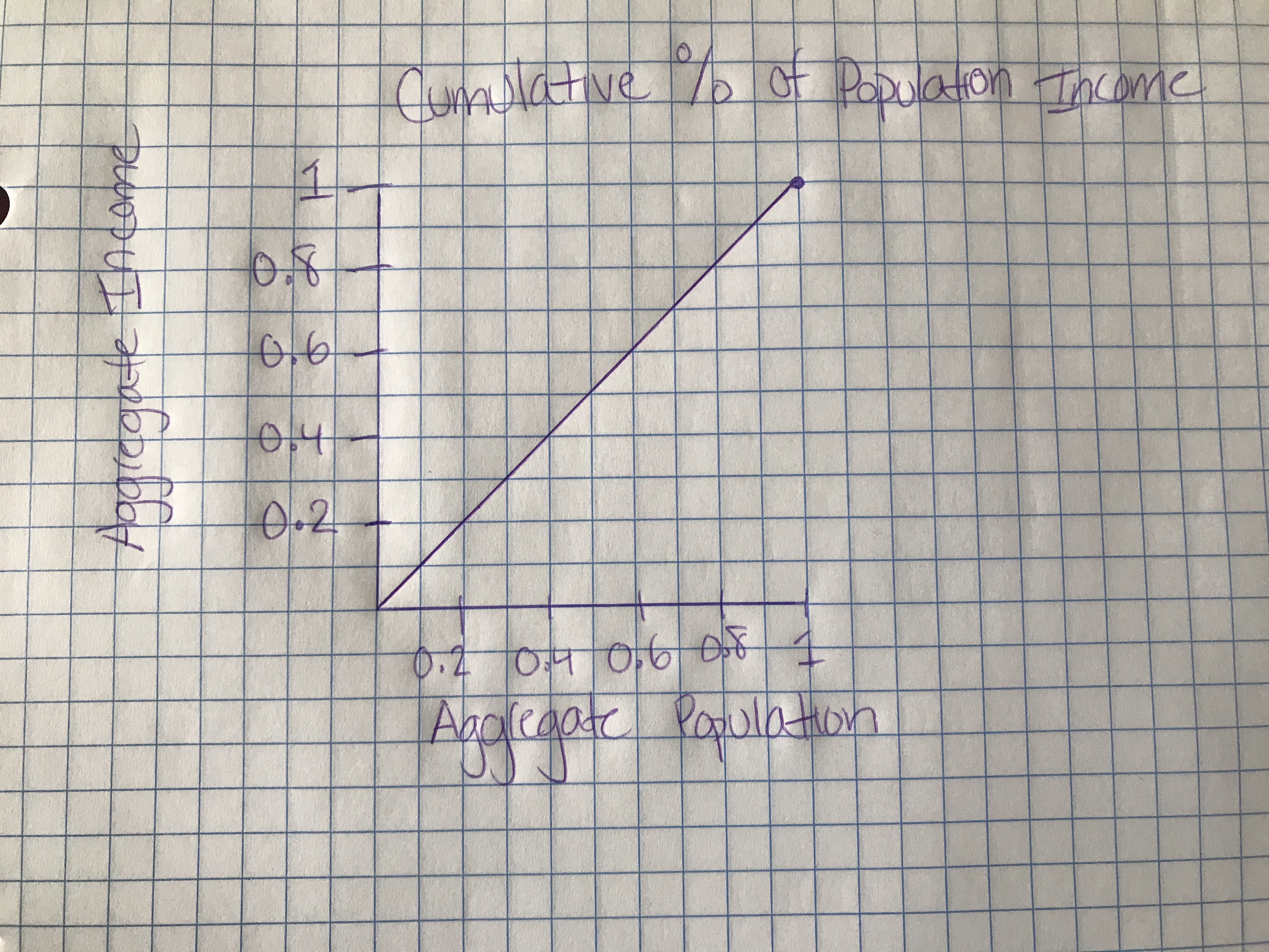
Lorenz Curves allows us to understand how the current state of economic equality within a nation compares to the gold standard of perfect income distribution. In an ideal scenario, with absolute income equality, income is distributed equally throughout the population. The Gini Coefficient, the numerical value of the area between the curves of "perfect income equality" and the Lorenz Curve, indicates just how prevalent income inequality is within a country. A high Gini Coefficient indicates a more significant imbalance, with high-income individuals receiving much larger percentages of the population's total income. A low Gini Coefficient indicates greater equality, with the aggregate income divided in equal proportions throughout a nation.
The area bounded by the extremes of perfect equity and perfect inequity is .5. Since we divide the area of the Lorenz Curve by the area bounded by the extremes, we are essentially multiplying it by 2.
In a society with perfect equity of income distribution, the Gini Index is 0. If we think about it logically, the Gini Index is calculated by taking the area bounded by the line of perfect equity and the Lorenz Curve and then dividing it by the area bounded by the extremes of perfect equity and perfect inequity. If our society has perfect income equality, then the area would be 0, as it would be the same exact line as the line of perfect equality. This would result in our Gini Index turning out as 0, a measure of perfect income distribution.
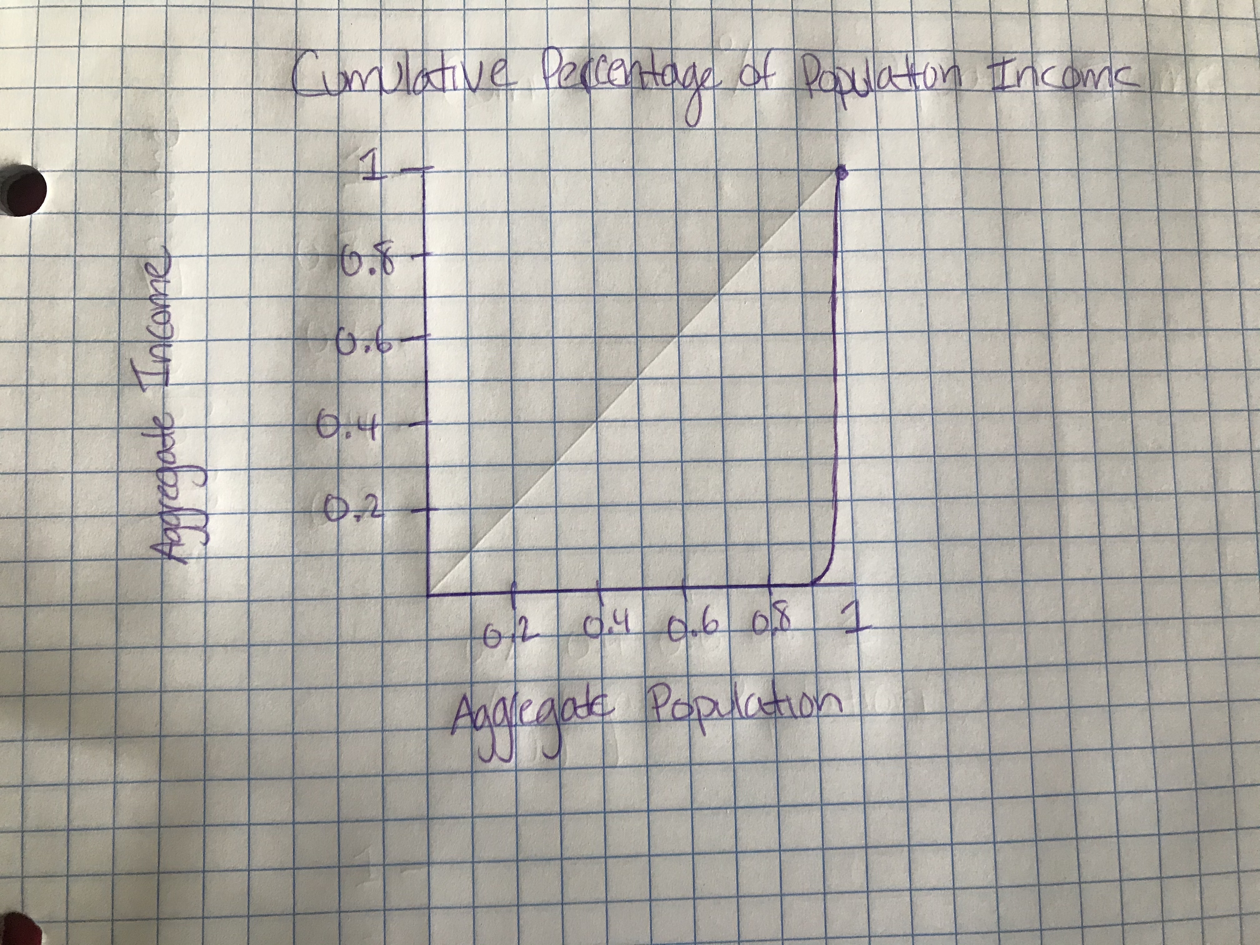
In a society with perfect inequality of income distribution, the Gini Index is 1. As. stated above, the index is found by dividing the two areas within our graph. If the area bounded by the line of perfect equity and the Lorenz Curve and the area bounded by the extremes of perfect equity and perfect inequity are the same, then when we divide, we will get a value of 1.
Using the information discussed in this section, we can estimate the Gini Index of the given income distribution to be around .3. Considering that this is supposed to be an estimate, there is no scientific way of figuring out the actual value. But when looking at the income distribution, one can estimate that the area bounded by the line of perfect equality and the Lorenz Curve is around a third of the total area underneath perfect income distribution.
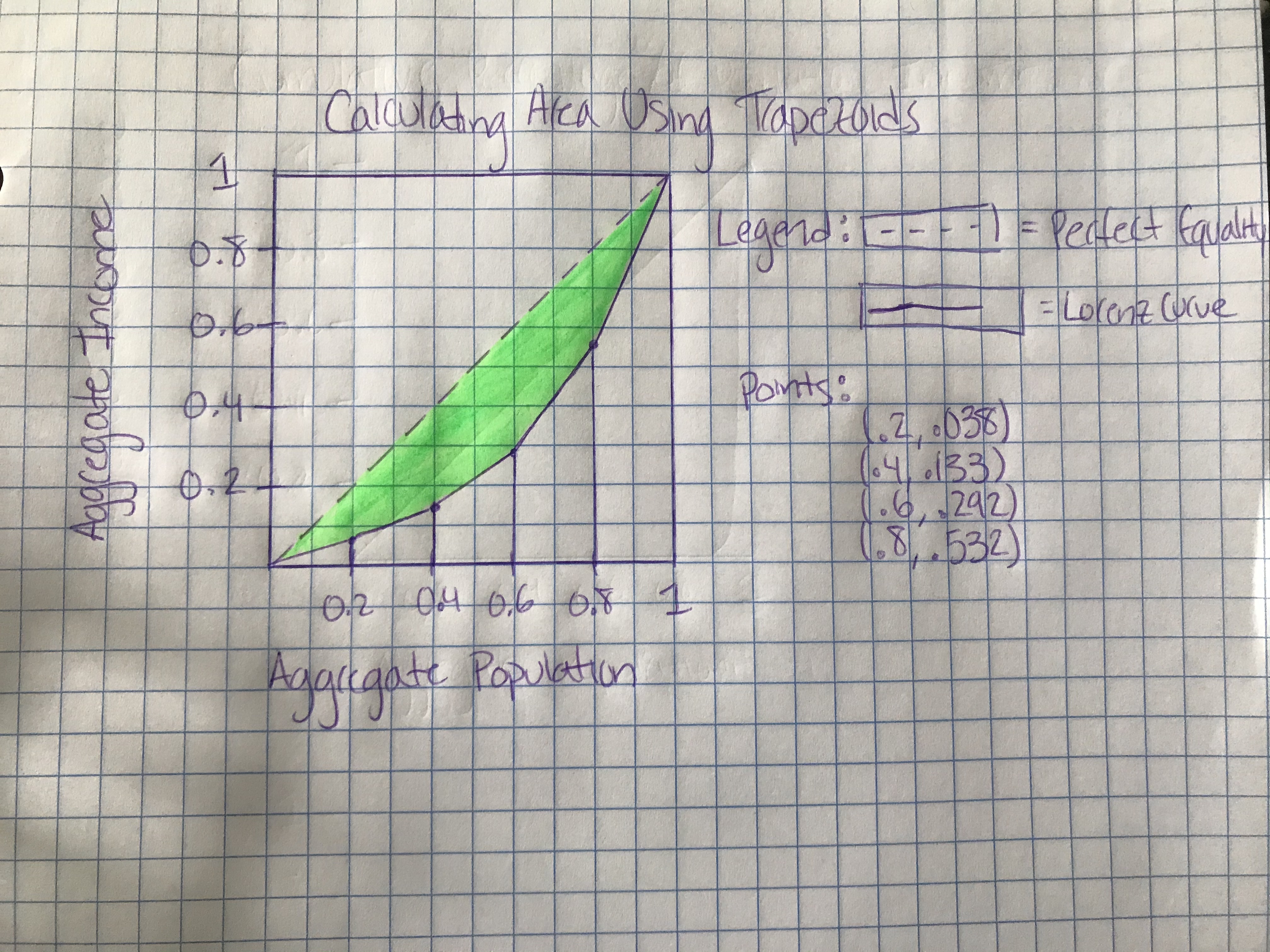
We are tasked with figuring out the Gini Index of the above shaded region; however, we are not given the forumla for the Lorenz Curve. While it may be a bit more work, we can still calculate the Gini Index by figuring out the area underneath the Lorenz Curve through trapezoids.
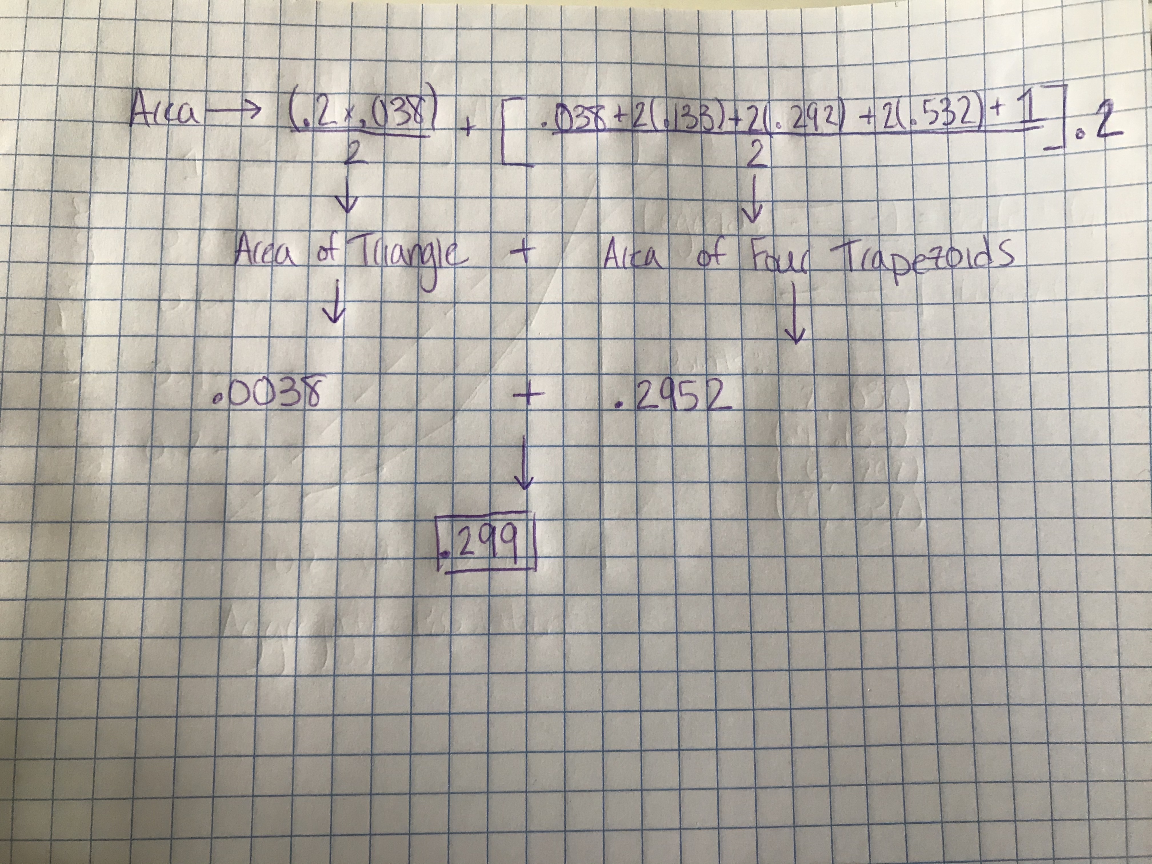
After calculating the trapizodal sum, in addition to the area of the triangle, we come across a value of .299. This would be the area of the region underneath the Lorenz Curve.
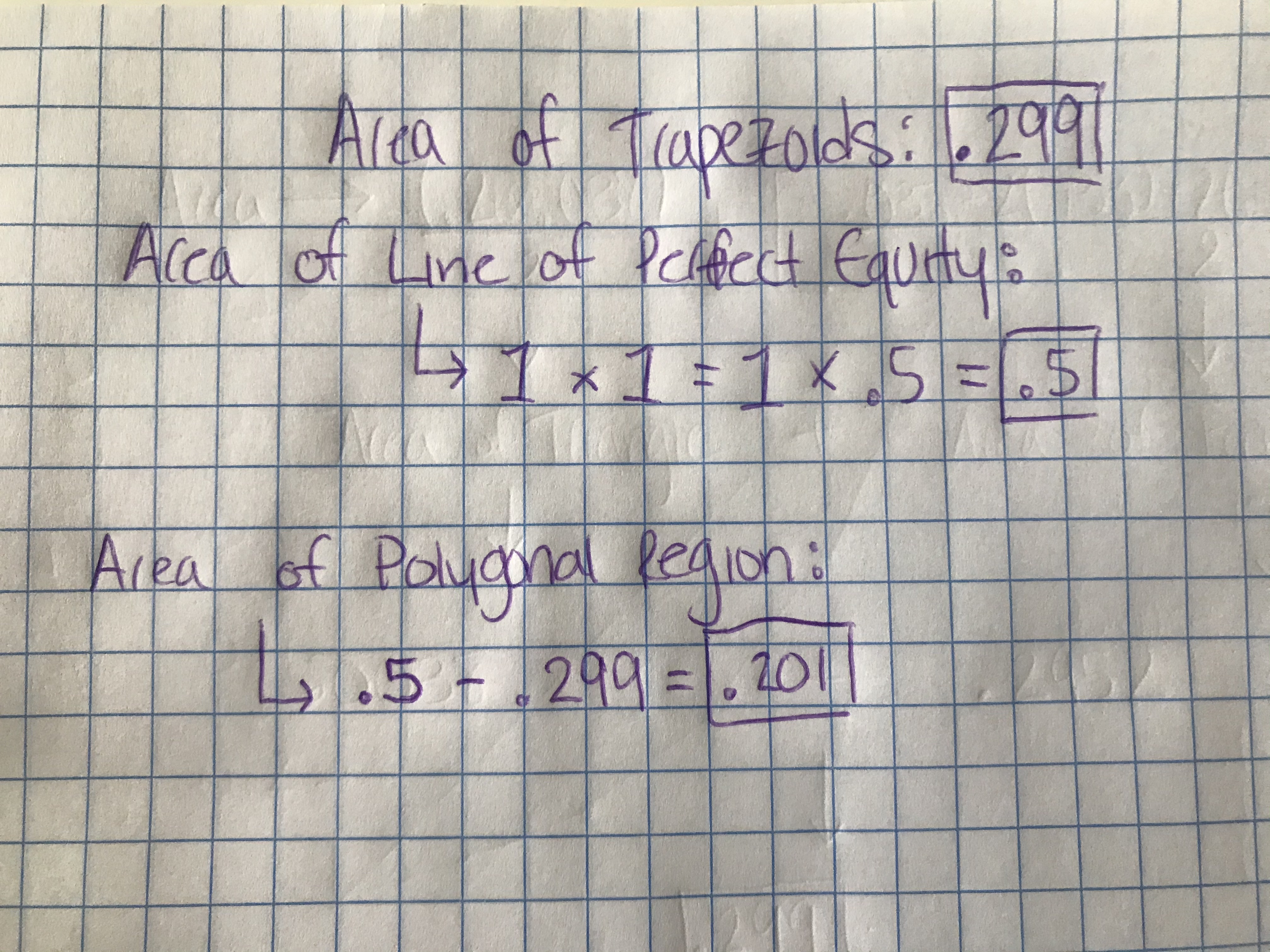
We can also calculate the area underneath the line of perfect equity. This is fairly straightforward as it is the area of a triangle. We get the value of .5. In order to calculate the area of the shaded region, we can subtract .299, the area of the trapezoids, from .5, the area of the entire triangle, to get a value of .201.
The formula for finding the Gini Index would be to take the area of the polygonal region and divide it by the total area under the line of perfect equity. In this case, that would be to divide .201 by .5, giving us an index of .402.
In all of the work above, we have established a way to calculate Gini Coefficents as a measure of income inequality within a country. At the top of this page, we saw what the Lorenz Curves of perfect equality and inequality look like and we used that information to build on how we can get our Gini Index. This process very much has real world applications, as major organisations, such as the World Bank, use it to calculate the severity of income inequality within countries. In fact, the solved Gini Index that we did above is very close to the Gini Coefficient of the United States. When we want to talk about income inequity, a very real problem in many countries, the Gini Index is a great way to see how severe the problem actually is. In fact, up to 2021, economists have found that the highest Gini Coefficents are found in developing countries, such as Nambia, Zambia, and Mozambique. One thing that is interesting though is the fact that some developing countries have lower Gini Coefficients than other developed nations. When we compare, for example, the United States and Guinea, a West African country, the data is somewhat intriguing. Guinea's Gini Index has gradually dropped from .468 in 1991 to .337 in 2012. When we look at the United States, our Gini Index has increased from .411 in 1990, to .480 as of 2021. While this may seem like a subtle difference, it's important to look at potential reasoning for why this is the case. Guinea does not have the same amount of wealth as the United States, in addition to the fact that its society is focused more towards the collective propestiy of the nation as a whole rather than just individuals. Meanwhile, Forbes has revealed that the top 1% of Americans make more than the bottom 50% combined, a true indication of a country that allows the economic enrichment of a few at the expense of others. As we continue to learn more about income inequality in this presentation, we will start to see the vast disparities in American economics, and we might even be able to come up with a reason why our country finds itself plagued with this issue.